Banco Pichincha is Ecuador's largest and most popular bank. It serves more than 4 million users through its digital platforms, including the website, mobile application, and web banking. It is a bank with a strong focus on transactional solutions for its personal banking clients.
The problem
The bank's public website had grown into a fragmented system of more than 250 pages. Different teams had created and managed content over time, which led to inconsistent navigation, duplicated pages, and important information becoming harder to find.
Why this mattered
The website served more than 2M users and was one of the main entry points to the bank's products and services. Migrating the site as-is would have moved years of UX debt into the new CMS.
My role
I led the information architecture and UI redesign, created the reusable CMS component system, and worked with brand, content, product, and engineering teams to align the new structure.
Outcomes
250+ pages analyzed
using analytics, dashboards, funnels, and stakeholder input
12% lower bounce rate
After improving navigation clarity and reducing low-value content
Higher engagement
Priority pages became easier to reach through a clearer site structure
Reusable components
standardized how teams created and maintained pages
01. Why we started
The problem was bigger than outdated pages. The website lacked structure.
For many customers, the public website was the first place they went to understand products, compare options, or find the next step. But the site had become difficult to use because it had been built in pieces by different departments over time.
Users were not always struggling because the information was missing. In many cases, the information existed, but it was buried, duplicated, or written around internal priorities instead of user needs.
The CMS migration made the problem visible. If we migrated every page without changing the structure, the bank would keep the same usability problems and make them harder to fix later.
02. The challenge
Redesign pages ≠ improve structure
The challenge was balancing user clarity, business priorities, brand standards, stakeholder needs, and technical constraints at the same time.
The main questions were:
- Which pages were critical for users and the business?
- Which pages were outdated, duplicated, or no longer useful?
- How could we make the site more consistent without making every page feel rigid?
- How could the new CMS support real publishing workflows after launch?
03. My approach
I audited the site with my UX partner, from both a user and business perspective.
250 pages
Analyzed using data
I pulled the numbers from Google Analytics and the internal dashboards, and worked with data engineers to build custom funnels for the paths those tools did not cover.
Then I ranked every page by traffic, business importance, and its role in the customer journey. That ranking is what showed us where the site was working, where users were dropping off, and where important pages were underperforming despite their business value.
One of the clearest findings was that some high-priority pages were receiving far less traffic than expected. That pointed to a navigation and information architecture issue, not just a content issue.
Schematic. The shape is the pattern the audit surfaced, not raw analytics values.
We also used customer interviews to understand how people experienced the site.
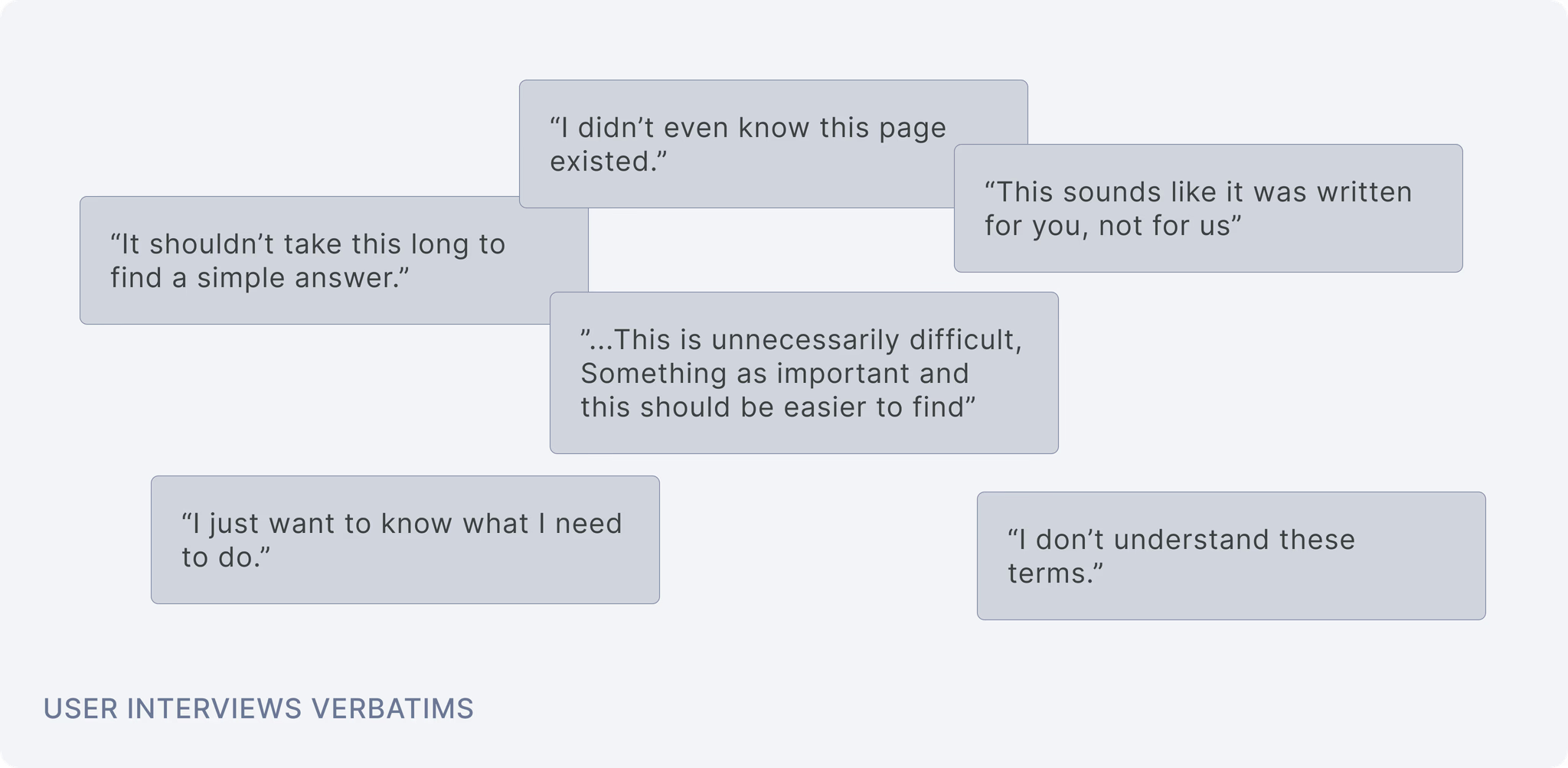
“It's really difficult to find anything on the website, I prefer calling the call center, it's quicker”
Across 20 customer interviews, we heard similar patterns. Users felt overwhelmed and often preferred calling instead of browsing. The issue was not only the amount of content. Much of the content was written to satisfy internal teams, not to help customers make decisions.
04. From findings to structure
We had the numbers from the audit, but not the reason behind them.
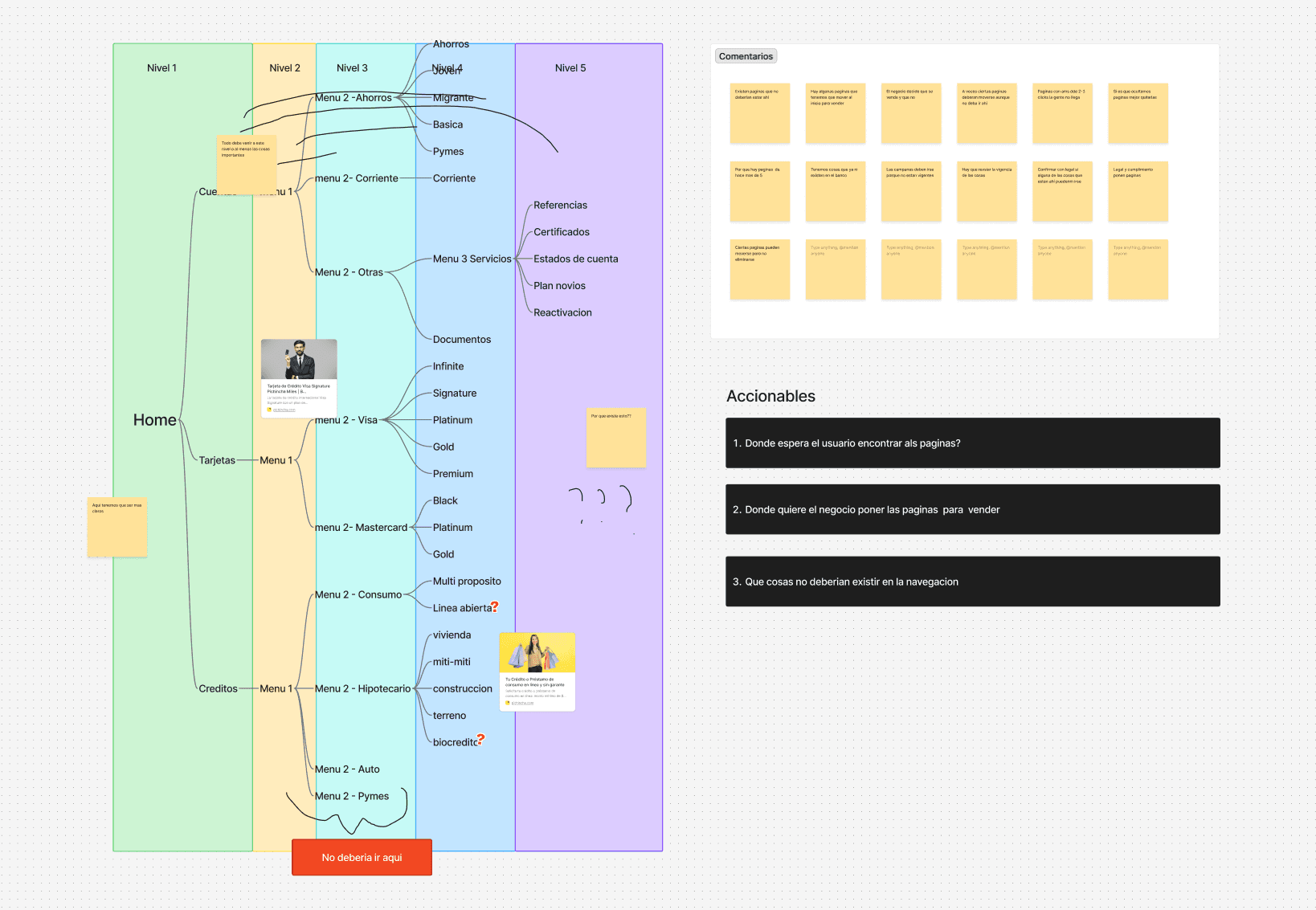
I mapped the full navigation tree and ran sessions with every area that owned pages, walking each team through the exact path a user had to follow to reach their content.
The finding
The site had five levels of navigation. Anything sitting between the third and the fifth level took three or four menus to reach, drew almost no traffic, and in most cases the area that owned it did not know it was there.
Some of the buried pages were disclosures the bank is legally required to surface from the first page. Nobody in the room knew they were missing.
We used the sessions to recategorize every page, move what had ended up in the wrong branch, and delete content that was expired or no longer relevant.
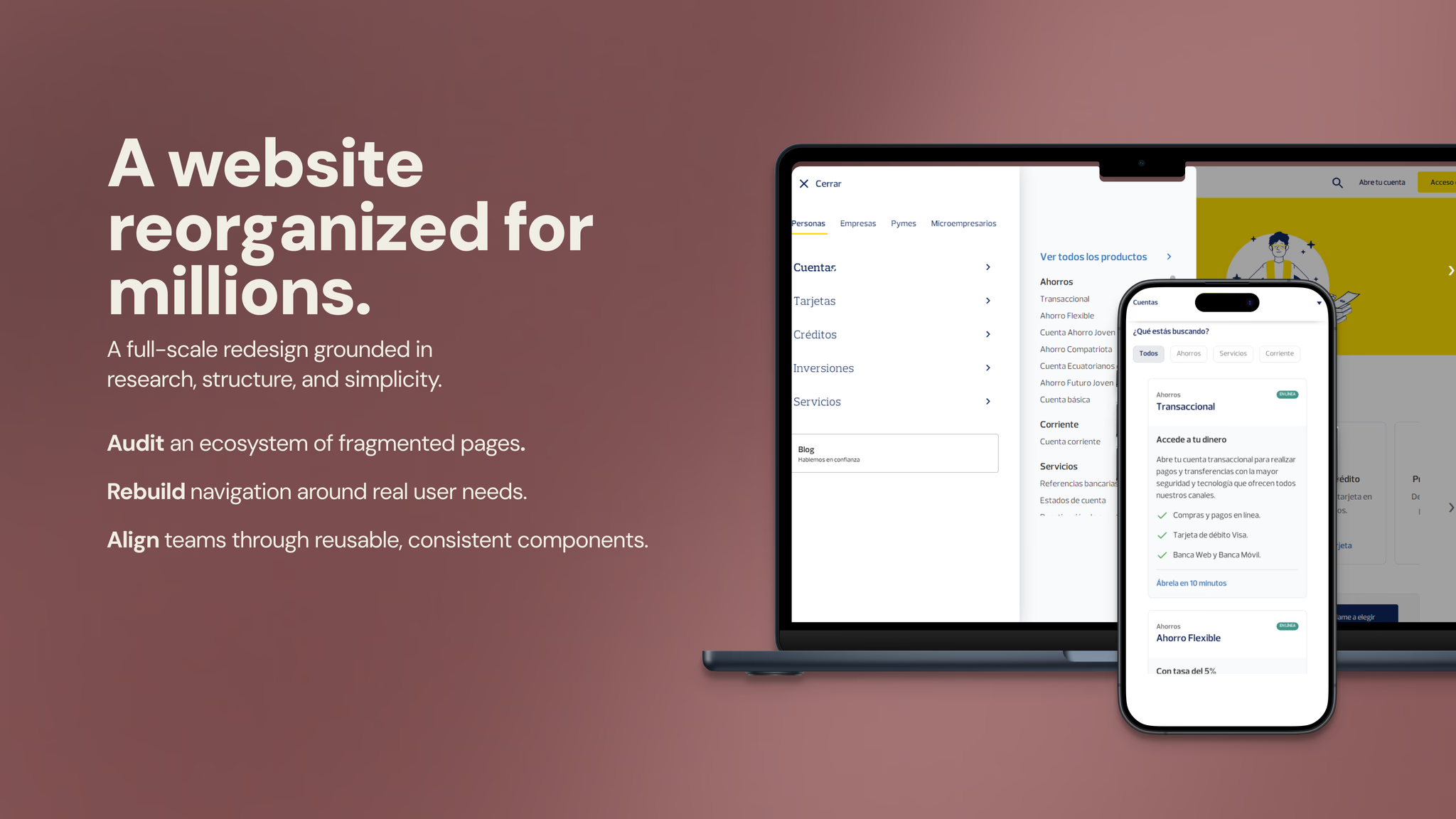
From nested menus to a mega menu
The old structure moved users through a chain: nav bar, menu page, submenu, destination. Every one of those steps was a new page load, and every one of them depended on guessing which label was hiding what they wanted.
The mega menu keeps the categories people already knew and shows all of them at once. One click and the full range of products and services is on screen. Where people are comparing options, a product catalogue sits before the destination page.
Two clicks now reach the page, instead of four menus and a reload at every level.
Then the pages themselves
The same review exposed the content. Pages were outdated walls of text, written in the language of the bank instead of the customer's. Routing people to a page they could not read would not have fixed anything.
So we scored the product pages of other banks on order, visual design, content, options, navigation, and access. Three actionables came out of it.
Speak the user's language
No banking jargon. Customers should not have to translate a product in order to understand it.
Repeat the same sections
Learn where the requirements sit on one page and you know where they are on all of them.
Design the content
Banking information is dense, so layout and hierarchy do as much work as the words.
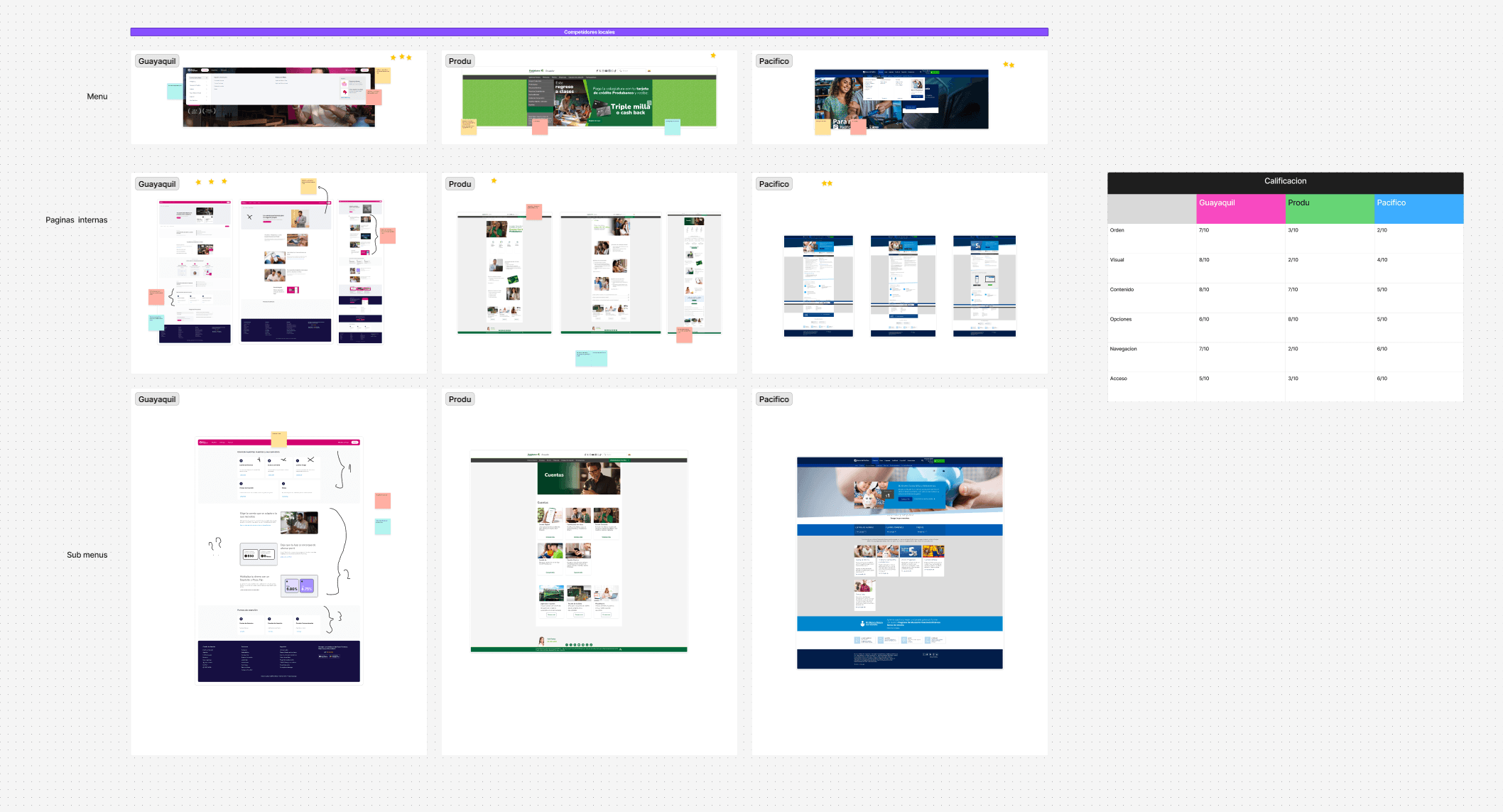
Those three actionables are what the component system had to deliver, and they are where the UI strategy started.
05. UI strategy
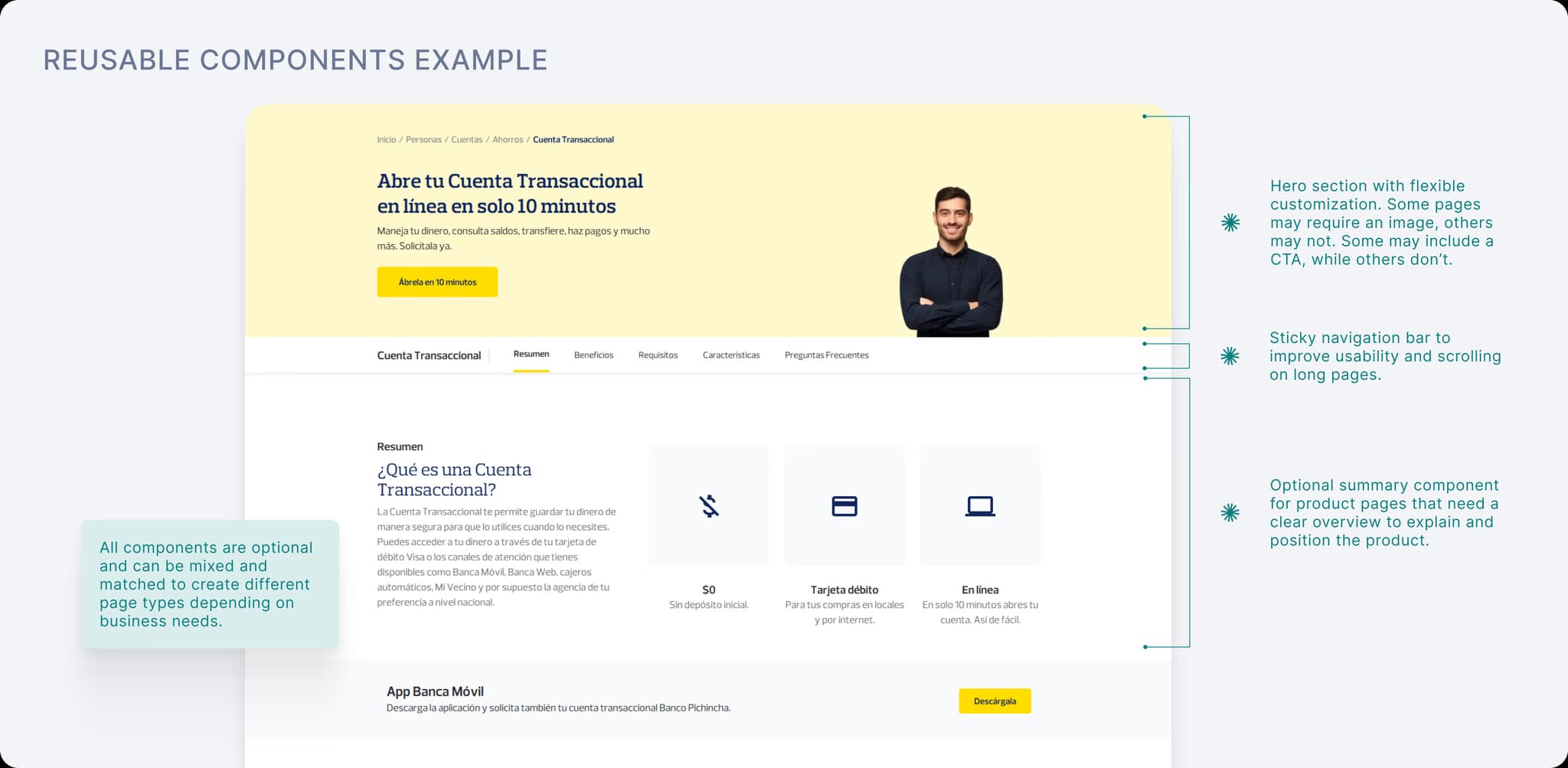
The component system had to be flexible enough for teams, but strict enough to prevent fragmentation.
At first, many stakeholders wanted custom layouts for their own product pages. Even when they agreed with the idea of templates, they often asked for exceptions.
I defended scalability of the system using the 80/20 principle:
- Components were designed to cover the needs of most pages.
- Edge cases were handled separately when there was a real reason.
- We avoided designing around every exception because that would recreate the same fragmented experience.
This gave teams enough flexibility to publish different types of content while keeping the overall website consistent.
06. Technical constraints
The CMS was more restrictive than we planned for
Once the technical team started building, the new CMS turned out to have tighter limits than the early demos suggested. Several of the interactions I had designed were not possible to build, at least not in the time the migration allowed.
So I had to decide what to protect. Visual detail and the richer interactions were the first things I let go. The architecture, the reusable templates, and the rules for how a page got assembled were not negotiable, because those were the parts that solved the original problem.
A few components went back to the drawing board and were rebuilt around what the CMS could actually render. The pages ended up simpler than my first designs, but the structure survived.
07. Key decisions and tradeoffs
Treat the migration as a chance to fix the structure
The CMS migration could have become a simple content transfer. Instead, we used it to question what should stay, what should be merged, and what needed a clearer path.
Use data to decide what deserved attention
With more than 250 pages, we could not redesign everything with the same level of effort. Analytics helped us prioritize the pages that mattered most, find underperforming content, and support decisions with evidence instead of internal preference.
Standardize around one master structure
We moved away from every team creating pages in their own way. The new model used one master page structure supported by flexible components. That meant giving up some visual variety, but the tradeoff was worth it: clearer navigation, more consistent pages, and a system that could be maintained over time.
Design for the people publishing the content
The component system was not only for users visiting the website. It also helped internal teams understand what content they needed to provide, where it belonged, and how each page should be assembled.
08. What changed
User side
The website became easier to navigate because priority pages had clearer paths and page layouts became more consistent. Users could reach important information with fewer steps, and the overall experience felt less fragmented. After launch, bounce rate dropped by 12%.
Business side
The redesign reduced duplicated and outdated content, standardized product pages through reusable CMS components, and gave teams a clearer governance model for future publishing.
The result was not just a cleaner website. It was a more sustainable way to manage a large public site across many departments.
09. What I learned
This project shows how I work when the problem is bigger than the screen.
The value came from identifying the real issue behind the brief, using data to focus the work, aligning teams with different priorities, and designing a system that could scale beyond launch.
It also reflects the kind of work I enjoy most: making complex digital experiences easier to understand, easier to use, and easier for teams to maintain.